CASE STUDY

Vehicle Quality Dashboard

Designing an automotive quality dashboard that helps teams move from fleet-wide signals to the issues with the highest operational and financial impact.

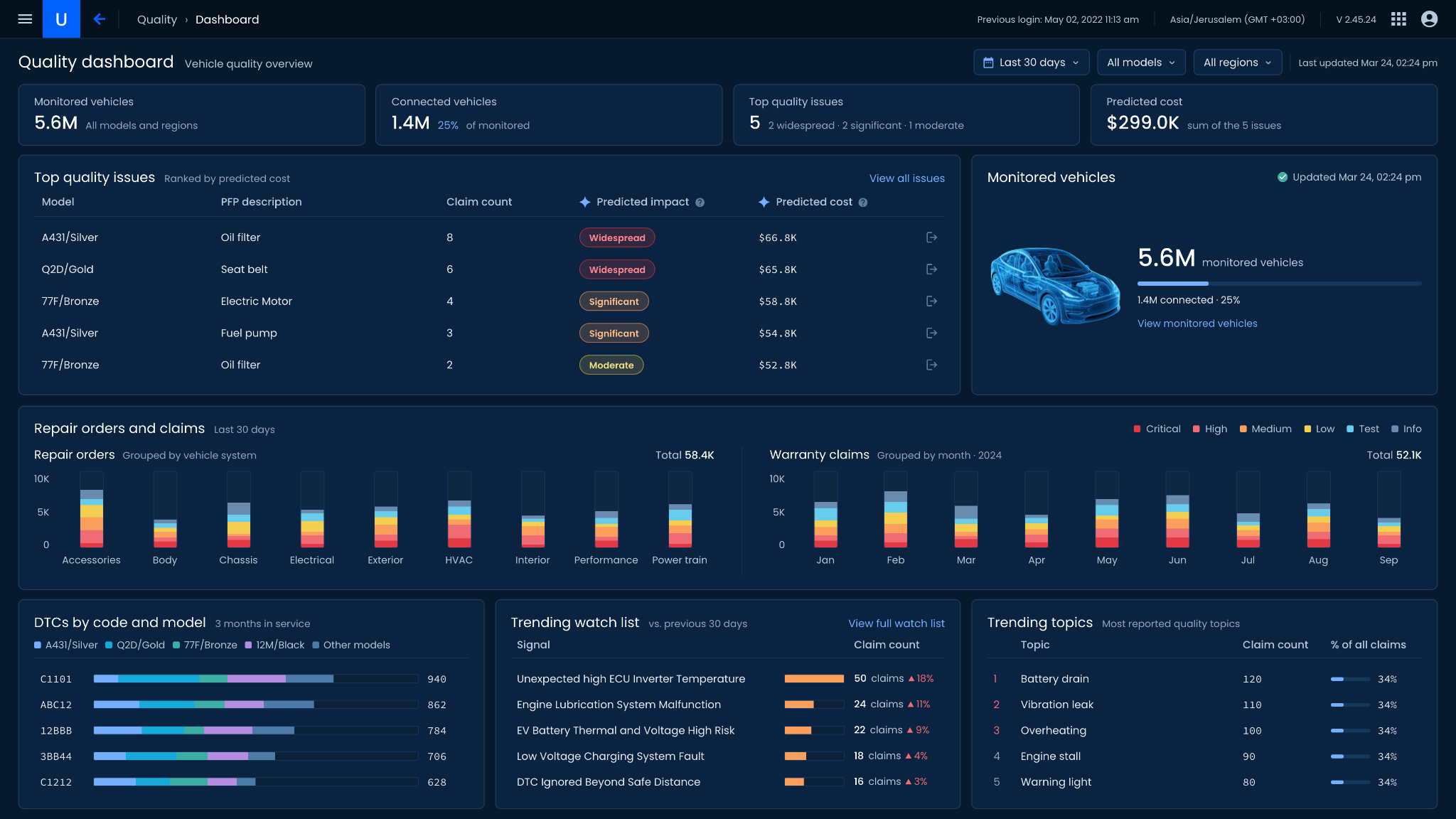
Vehicle Quality Dashboard: KPI overview of monitored vehicles (5.6M), connected vehicles (1.4M, 25%), top quality issues (5) and predicted cost ($299.0K); Top quality issues ranked by predicted cost with model, PFP description, claim count, predicted impact and predicted cost; Monitored vehicles; Repair orders by vehicle system and warranty claims by month; DTCs by code and model; Trending watch list; and Trending topics
ROLE
Senior Product Designer
DOMAIN
Automotive Quality Analytics
FOCUS
Operational Overview & Prioritization
SCOPE
Product Framing · Information Architecture · UX · UI · Dashboard Design
COLLABORATION
2 Product Managers · OEM Quality Engineer

01

CONTEXT

Vehicle quality data is useful only when teams can see what deserves attention first.

Automotive quality teams work across different signals: monitored vehicles, connected coverage, repair orders, warranty claims, diagnostic trouble codes, recurring topics, and emerging issues.

Each signal tells part of the story, but they do not carry the same business impact or urgency.

The dashboard needed to bring those signals into one operational view while making it clear which issues deserve attention first, what their potential impact is, and which patterns may be starting to emerge.

The challenge was not simply displaying vehicle-quality data, but turning it into a clear order of attention.

02

THE CHALLENGE

High volume does not always mean high priority.

A frequently reported problem may affect many vehicles but have relatively limited impact.

Another issue may appear less often while carrying a higher predicted cost or broader predicted impact.

At the same time, quality teams need enough context to understand whether an issue is isolated, widespread, model-specific, or beginning to trend.

The dashboard therefore needed to answer several questions:

  • What is the scale of the monitored fleet?

  • Which known issues deserve attention first?

  • Where are repair orders and warranty claims concentrated?

  • Which diagnostic patterns appear across models?

  • Which signals are beginning to trend?

The design problem became one of turning a dense quality dataset into a clear hierarchy of attention.

03

RESEARCH

Understanding what belongs on the dashboard, and what needs to come first.

The research focused on content definition and information hierarchy.

What I needed to understand

  1. 01

    What information is essential for the quality team?

    Which metrics and signals need to remain visible in the main operational view?

  2. 02

    How should quality issues be prioritized?

    Which signals help distinguish a high-volume issue from one with meaningful operational or financial impact?

  3. 03

    What supporting context explains the priority?

    Which fleet, claims, diagnostic, and trend signals help determine whether an issue is widespread, model-specific, or emerging?

How I learned

  1. 01

    Product Manager conversations

    I worked with two Product Managers to define the information that needed to appear in the dashboard and clarify the business meaning behind the different quality metrics.

  2. 02

    OEM Quality Engineer conversation

    I spoke with an OEM Quality Engineer to understand how vehicle-quality information is evaluated in practice.

    The conversation focused on what needs to be visible first, which information is secondary, and how the dashboard hierarchy should support prioritization.

What I learned

  1. 01

    Establish scope before detail

    Fleet size and connected coverage provide the context for interpreting the quality signals that follow.

  2. 02

    Issue priority cannot rely on claim count alone

    Frequency matters, but predicted impact and cost help identify where attention is more valuable.

  3. 03

    Current problems and emerging signals are different questions

    Known issues require prioritization, while rising patterns help expose what may become important next.

  4. 04

    Operational volume needs structure

    Repair orders and warranty claims become more useful when organized by vehicle system and time.

  5. 05

    Diagnostic signals need model context

    A DTC count becomes more meaningful when users can also see how it is distributed across vehicle models.

RESEARCH DIRECTION

FROM

A collection of quality metrics

TO

Scope → Priority → Operational context → Emerging signals

04

KEY PRODUCT DECISIONS

The dashboard was structured around the questions a quality team needs to answer in sequence.

DECISION 01

Establish the scale of the monitored environment first

PROBLEM

Quality metrics are difficult to interpret without knowing the size and coverage of the vehicle population behind them.

DECISION

Start with a compact overview of:

  • Monitored vehicles
  • Connected vehicles
  • Top quality issues
  • Predicted cost

RATIONALE

The first layer gives users immediate context for both the monitored environment and the current quality exposure.

DECISION 02

Prioritize issues by impact, not frequency alone

PROBLEM

Claim count indicates how often an issue appears, but it does not necessarily indicate how important it is.

DECISION

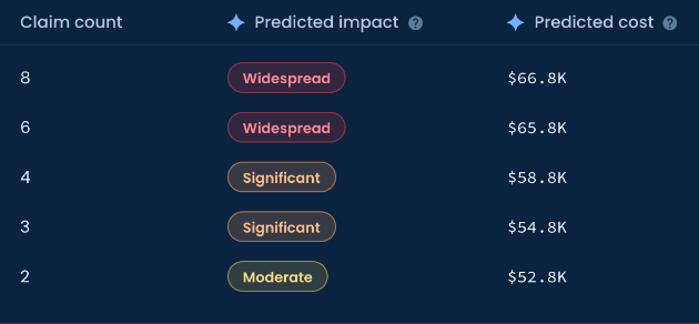
Use a Top quality issues view that combines:

  • model
  • issue description
  • claim count
  • predicted impact
  • predicted cost

Rank the issues by predicted cost and classify their impact as:

Widespread · Significant · Moderate

RATIONALE

This lets users compare frequency with expected impact instead of treating the most common issue as automatically the most important.

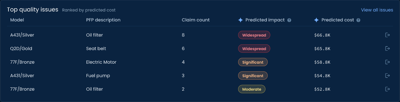
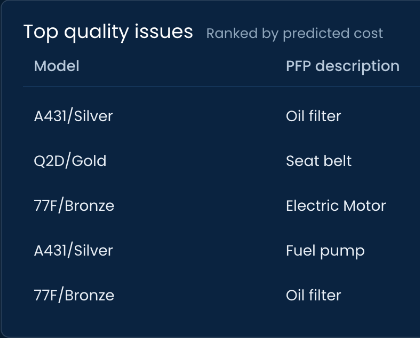
Top quality issues ranked by predicted cost: A431/Silver oil filter, 8 claims, widespread, $66.8K; Q2D/Gold seat belt, 6 claims, widespread, $65.8K; 77F/Bronze electric motor, 4 claims, significant, $58.8K; A431/Silver fuel pump, 3 claims, significant, $54.8K; 77F/Bronze oil filter, 2 claims, moderate, $52.8K; beside Monitored vehicles, 5.6M monitored and 1.4M connected (25%)
Top quality issues ranked by predicted cost, with model, PFP description, claim count, predicted impact and predicted cost for five issues
Top quality issues ranked by predicted cost: models and PFP descriptions — A431/Silver oil filter, Q2D/Gold seat belt, 77F/Bronze electric motor, A431/Silver fuel pump, 77F/Bronze oil filterThe same five issues: claim count 8, 6, 4, 3, 2; predicted impact Widespread, Widespread, Significant, Significant, Moderate; predicted cost $66.8K, $65.8K, $58.8K, $54.8K, $52.8K

DECISION 03

Separate operational volume from issue prioritization

PROBLEM

Repair orders and warranty claims provide important context, but they answer a different question from the prioritized issue list.

DECISION

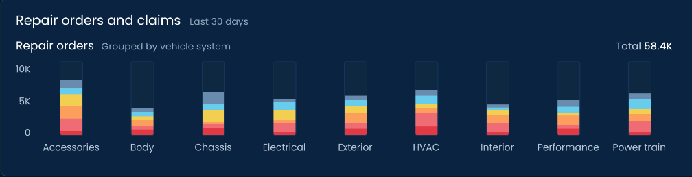
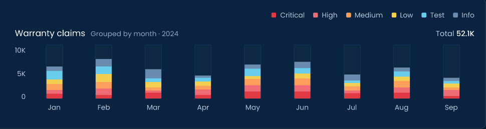
Give operational activity its own layer:

Repair orders grouped by vehicle system

and

Warranty claims grouped over time.

Keep severity visible through consistent stacked color coding.

RATIONALE

This shows where service activity is concentrated without allowing raw volume to compete with the primary prioritization model.

Repair orders and claims, last 30 days: repair orders grouped by vehicle system (accessories, body, chassis, electrical, exterior, HVAC, interior, performance, power train), total 58.4K, and warranty claims grouped by month from January to September 2024, total 52.1K, both stacked by severity from critical to info
Repair orders and claims, last 30 days: repair orders grouped by vehicle system, total 58.4KWarranty claims grouped by month in 2024, total 52.1K, with the severity legend Critical, High, Medium, Low, Test, Info

DECISION 04

Use multiple signals to expose emerging quality patterns

PROBLEM

Current high-impact issues do not reveal everything the quality team needs to watch.

New problems can first appear as diagnostic patterns, rising claim counts, or repeated topics.

DECISION

Combine three complementary views:

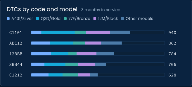
  • DTCs by code and model
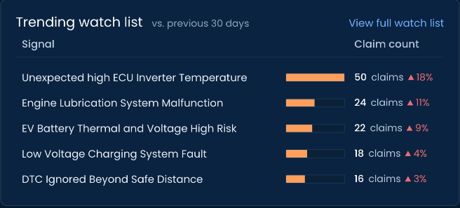
  • Trending watch list
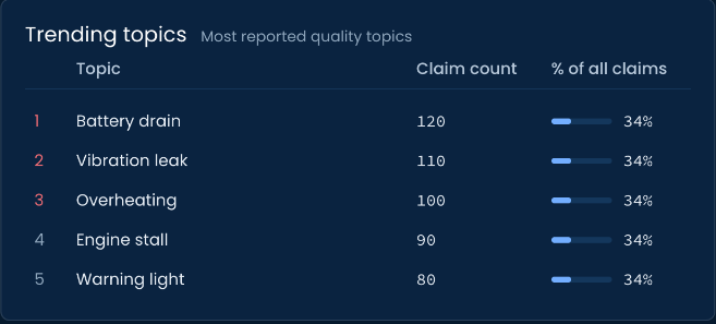
  • Trending topics

DTCs show diagnostic distribution across models.

The watch list highlights signals whose claim counts are increasing.

Trending topics surface recurring quality themes across claims.

RATIONALE

Together, these views extend the dashboard beyond known problems and expose patterns that may require attention next.

DTCs by code and model over 3 months in service, stacked across models A431/Silver, Q2D/Gold, 77F/Bronze, 12M/Black and other models; Trending watch list versus the previous 30 days, led by unexpected high ECU inverter temperature at 50 claims, up 18%; and Trending topics, led by battery drain at 120 claims
DTCs by code and model over 3 months in service, stacked by model, for codes C1101, ABC12, 12BBB, 3BB44 and C1212Trending watch list versus the previous 30 days, signals with claim counts and increases, led by unexpected high ECU inverter temperature at 50 claimsTrending topics, most reported quality topics: battery drain, vibration leak, overheating, engine stall, warning light, with claim counts and share of all claims

05

THE EXPERIENCE

One dashboard, four levels of quality understanding.

  1. 01Assess
  2. 02Prioritize
  3. 03Contextualize
  4. 04Detect

01ASSESS

Understand the fleet and current quality state.

The user begins with monitored and connected vehicle coverage, the number of priority issues, and their combined predicted cost.

This establishes the scale of the environment and the current quality exposure.
02PRIORITIZE

Identify the issues with the highest impact.

Top quality issues combines claim frequency, predicted impact, and predicted cost so attention can move beyond volume alone.

03CONTEXTUALIZE

Understand where quality activity is concentrated.

Repair orders and warranty claims show how operational volume is distributed across vehicle systems and over time.

04DETECT

Identify emerging patterns before they become top issues.

DTC distribution, rising watch-list signals, and trending topics expose patterns that may not yet appear among the highest-cost issues.

From quality data to an order of attention.

The Vehicle Quality Dashboard brings fleet coverage, quality issues, service activity, diagnostics, and emerging trends into one operational hierarchy.

It moves from understanding the monitored population, to prioritizing high-impact issues, to explaining the activity behind them, and finally to exposing signals that may require attention next.

Understand the fleet.

Prioritize the impact.

Watch what is emerging.