CASE STUDY

XDR Dashboard

Designing a security operations dashboard that turns alerts, threats, vulnerabilities, assets, and telemetry into a clear operational picture.

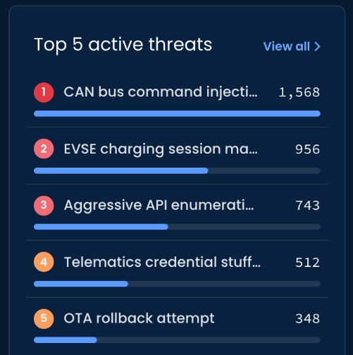
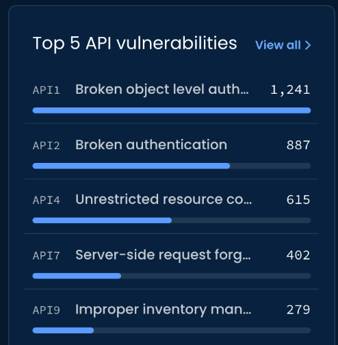
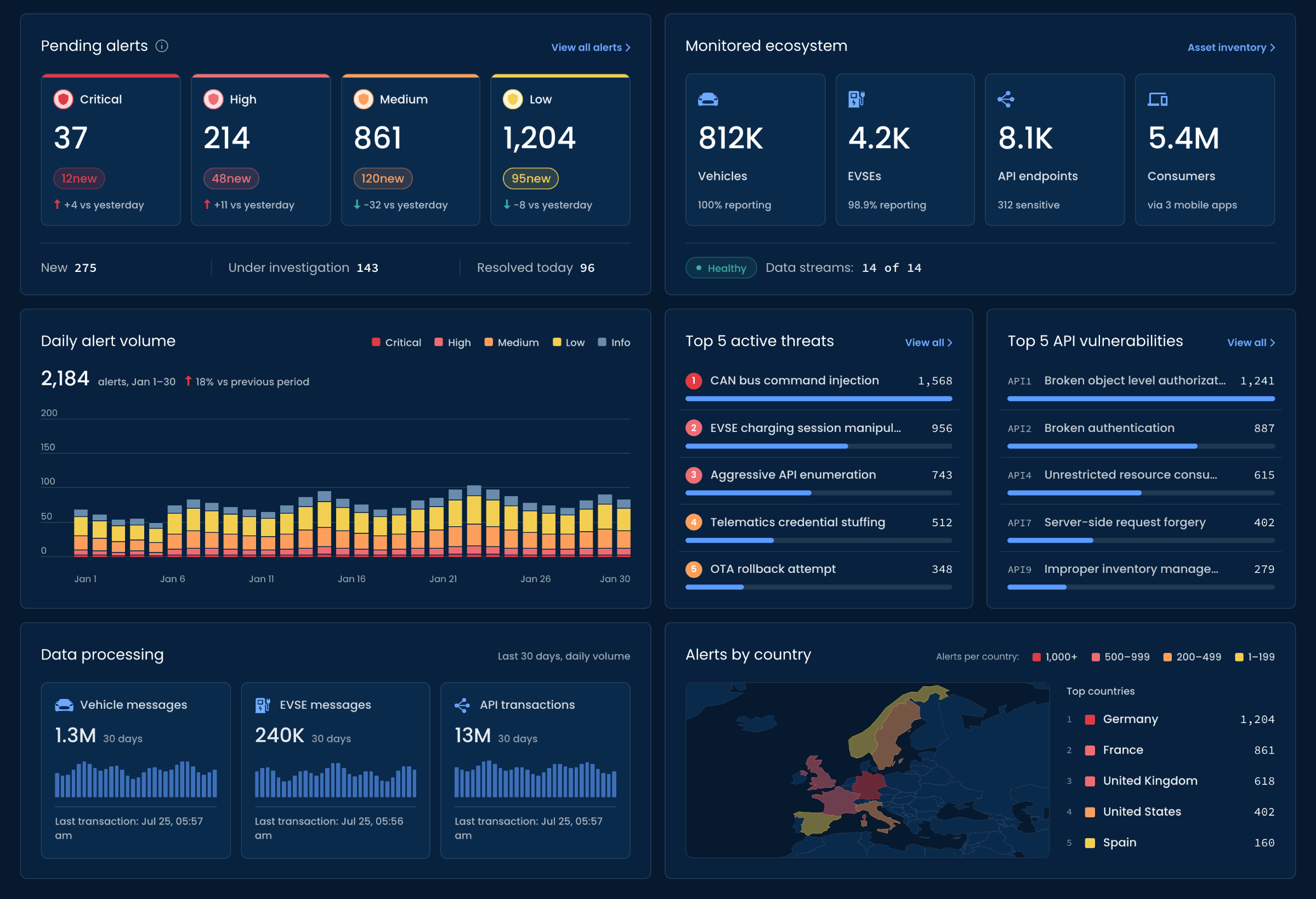
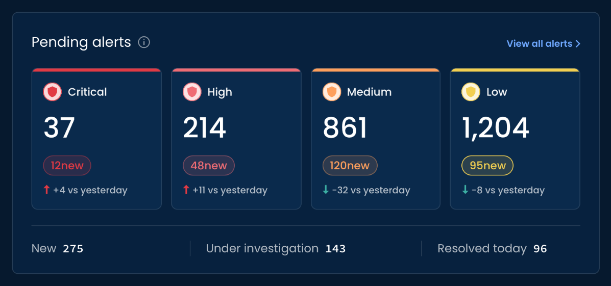
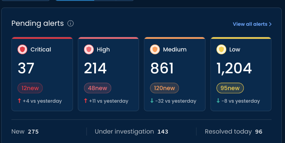
XDR Dashboard: Pending alerts by severity (Critical, High, Medium, Low) with new-alert counts and change vs yesterday; Monitored ecosystem (Vehicles, EVSEs, API endpoints, Consumers) with data-stream health; Daily alert volume; Top 5 active threats; Top 5 API vulnerabilities; Data processing; and Alerts by country XDR Dashboard, mobile crop: the Pending alerts panel with Critical, High, Medium and Low counts, new-alert counts, change vs yesterday, and New, Under investigation and Resolved today totals
ROLE
Senior Product Designer
DOMAIN
Automotive Cybersecurity
FOCUS
Operational Overview & Prioritization
SCOPE
UX Strategy · Information Architecture · UI · Dashboard Design
COLLABORATION
2 Product Managers · VSOC Analysts

01

CONTEXT

Security operations generate more signals than a dashboard can treat equally.

An XDR environment brings together multiple layers of information: incoming alerts, monitored assets, active threats, vulnerabilities, telemetry volume, and geographic activity.

Each of these signals can be useful, but they do not carry the same urgency.

The dashboard needed to give the VSOC a broad picture of the environment while making it immediately clear where attention should go first.

The challenge was therefore not simply deciding what data to display, but determining how that data should be organized and prioritized.

02

THE CHALLENGE

A dashboard can show everything and still fail to show what matters first.

Security analysts need to scan a large amount of information quickly.

If every metric receives the same visual weight, the analyst is forced to interpret the dashboard before they can use it.

The dashboard needed to answer several questions at different levels.

  • What requires attention now?

    How many alerts are pending, and how severe are they?

  • What is happening across the environment?

    Are alert volumes changing? Which threats and vulnerabilities are most active?

  • Is the monitored ecosystem healthy?

    Are assets reporting correctly, and is telemetry continuing to arrive?

  • Where is the activity concentrated?

    Which geographies, asset types, or data streams contribute most to the current picture?

The design challenge was to support all of these questions without turning the screen into a wall of equally weighted metrics.

03

RESEARCH

Understanding what belongs on the dashboard, and what deserves priority.

The research focused less on individual interactions and more on content selection and information hierarchy.

What I needed to understand

  1. 01

    What information must be visible?

    Which metrics and operational signals are essential enough to deserve space on the main XDR dashboard?

  2. 02

    What should analysts see first?

    Which information requires immediate attention, and which information can remain secondary?

  3. 03

    How should signals with different levels of urgency coexist?

    How can alerts, assets, threats, vulnerabilities, telemetry, and geographic activity be presented as one coherent operational picture without giving every signal the same visual weight?

How I learned

  1. 01

    Product Manager conversations

    I worked with two Product Managers to identify the information they considered essential for the dashboard and to clarify the product and operational context behind each metric.

  2. 02

    VSOC conversations

    I spoke with VSOC analysts about information hierarchy: what they need to understand first, what supports prioritization, and what can remain available as secondary context.

  3. 03

    Comparative dashboard review

    I reviewed several cybersecurity dashboards to examine how other products structure dense operational information, use visual hierarchy, and balance high-level status with deeper supporting metrics.

    The review was used for inspiration and pattern discovery, not as a template for the final structure.

What I learned

  1. 01

    Hierarchy matters more than density

    The dashboard could contain a large amount of information as long as the most urgent signals were visually distinguishable from supporting context.

  2. 02

    Immediate workload belongs at the top

    Pending alerts and severity provide the clearest indication of what may require analyst attention now.

  3. 03

    Security workload and ecosystem health are different questions

    The dashboard needed to show both the current security workload and whether the monitored environment itself was reporting normally.

  4. 04

    Trends and rankings help turn volume into priority

    A raw count becomes more useful when analysts can also see change over time and identify the threats or vulnerabilities contributing most to the activity.

  5. 05

    Supporting operational context should remain visible without dominating

    Telemetry volume and geographic distribution provide useful context, but they should not compete visually with active security signals.

RESEARCH DIRECTION

FROM

A collection of metrics

TO

Urgency → Security activity → Operational context

04

KEY PRODUCT DECISIONS

The dashboard was structured around levels of operational attention.

DECISION 01

Put the immediate security workload first

PROBLEM

The dashboard contains many types of information, but only some indicate work that may require immediate analyst attention.

DECISION

Place Pending alerts at the top of the dashboard and organize them by severity:

Critical · High · Medium · Low

Support the totals with new-alert counts and directional change.

RATIONALE

The first layer should let the analyst understand the current workload without interpreting the entire dashboard.
DECISION 02

Pair security workload with ecosystem health

PROBLEM

A change in security activity is difficult to interpret without understanding whether the monitored environment and its data streams are operating normally.

DECISION

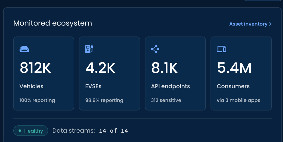
Place Monitored ecosystem alongside Pending alerts, showing the scale and reporting status of:

Vehicles · EVSEs · API endpoints · Consumers

along with overall data-stream health.

RATIONALE

The analyst can immediately distinguish between the security picture and the health of the environment generating that picture.

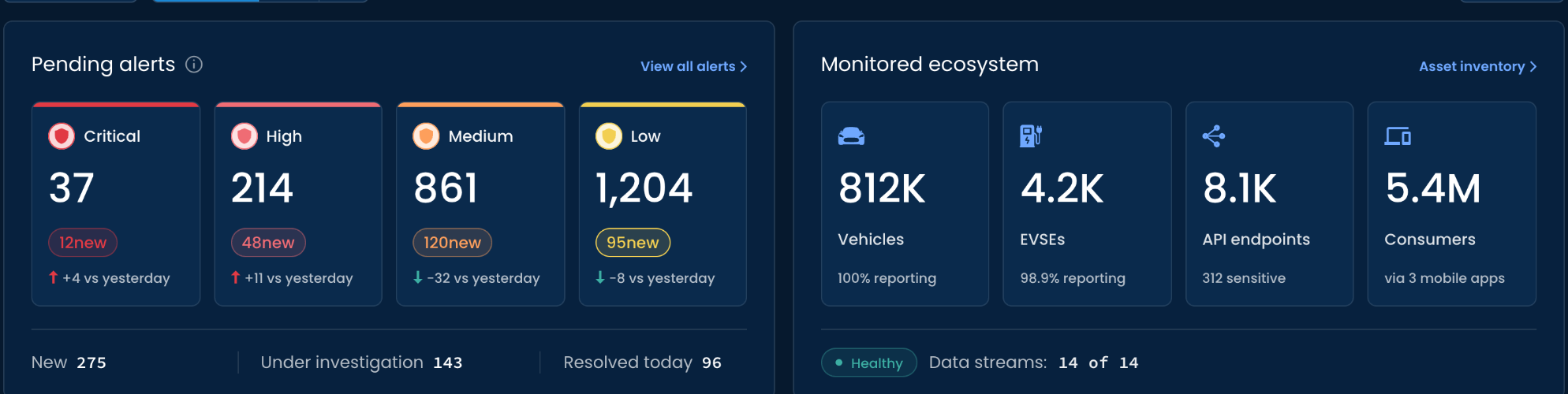
Pending alerts by severity (Critical 37, High 214, Medium 861, Low 1,204) with new-alert counts and change vs yesterday, and New, Under investigation and Resolved today totals, beside Monitored ecosystem: 812K vehicles, 4.2K EVSEs, 8.1K API endpoints and 5.4M consumers with reporting status, and data streams Healthy, 14 of 14
Pending alerts: Critical 37, High 214, Medium 861, Low 1,204, with new-alert counts, change vs yesterday, and New 275, Under investigation 143, Resolved today 96 Monitored ecosystem: 812K vehicles (100% reporting), 4.2K EVSEs (98.9% reporting), 8.1K API endpoints (312 sensitive), 5.4M consumers (via 3 mobile apps), data streams Healthy, 14 of 14

DECISION 03

Move from totals to the signals driving them

PROBLEM

Alert totals alone do not explain what is driving the current security picture.

DECISION

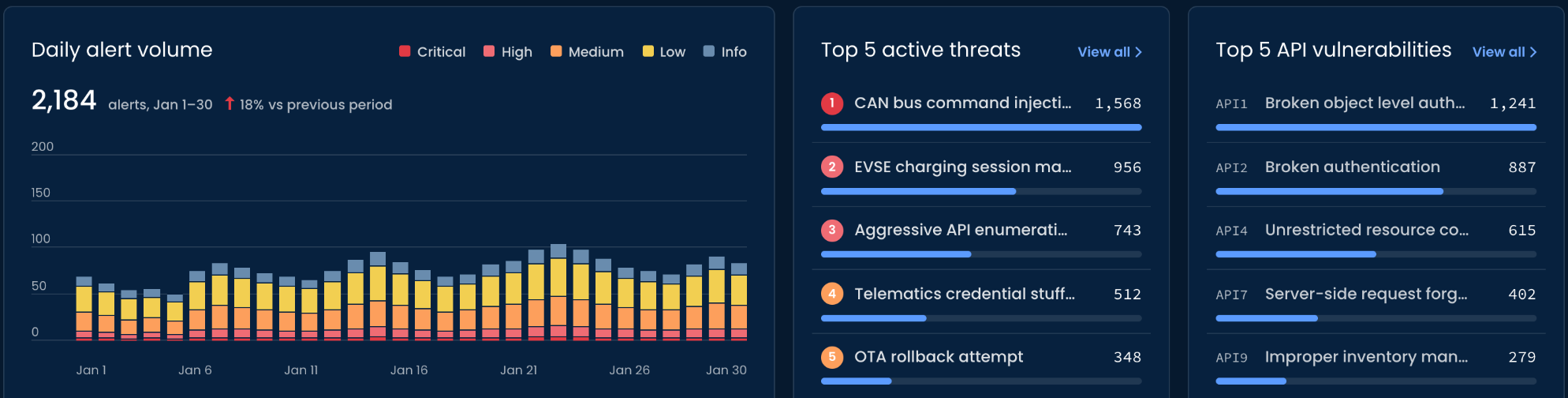
Use the next dashboard layer to combine:

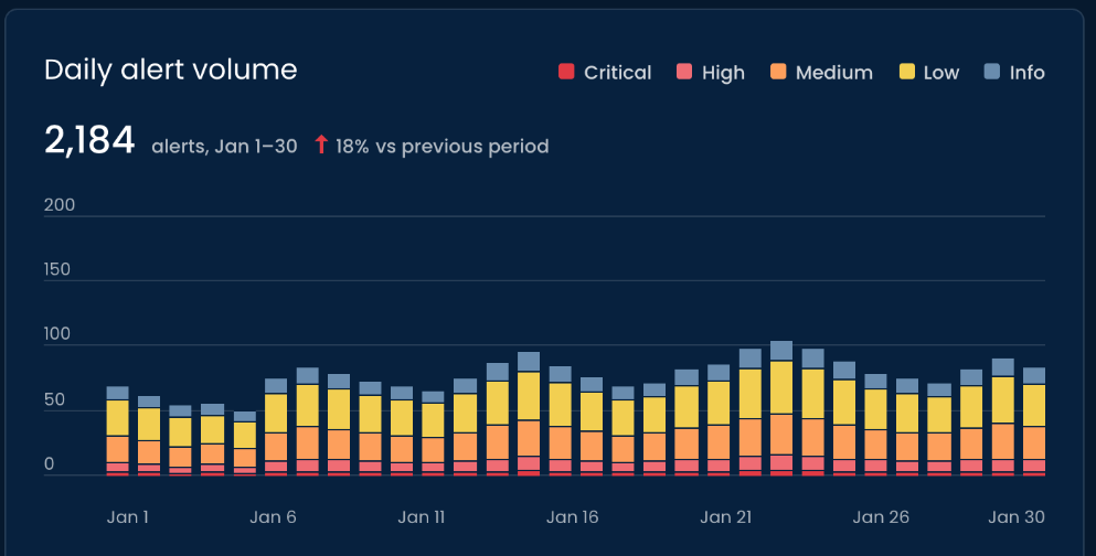
  • Daily alert volume
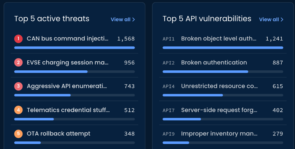
  • Top active threats
  • Top API vulnerabilities

The trend provides temporal context, while ranked lists expose the security issues contributing most strongly to the current activity.

RATIONALE

The analyst can move from:

“How much activity is there?”

to:

“What is driving it?”

Daily alert volume: 2,184 alerts, Jan 1–30, up 18% vs previous period, as stacked daily bars by severity; Top 5 active threats led by CAN bus command injection (1,568), EVSE charging session manipulation (956) and aggressive API enumeration (743); Top 5 API vulnerabilities led by broken object level authorization (1,241), broken authentication (887) and unrestricted resource consumption (615)
Daily alert volume: 2,184 alerts, Jan 1–30, up 18% vs previous period, as stacked daily bars by severity (Critical, High, Medium, Low, Info) Top 5 active threats (CAN bus command injection 1,568; EVSE charging session manipulation 956; aggressive API enumeration 743; telematics credential stuffing 512; OTA rollback attempt 348) beside Top 5 API vulnerabilities (broken object level authorization 1,241; broken authentication 887; unrestricted resource consumption 615; server-side request forgery 402; improper inventory management 279)
Daily alert volume: 2,184 alerts, Jan 1–30, up 18% vs previous period, as stacked daily bars by severity (Critical, High, Medium, Low, Info) Top 5 active threats: CAN bus command injection 1,568; EVSE charging session manipulation 956; aggressive API enumeration 743; telematics credential stuffing 512; OTA rollback attempt 348 Top 5 API vulnerabilities: broken object level authorization 1,241; broken authentication 887; unrestricted resource consumption 615; server-side request forgery 402; improper inventory management 279

DECISION 04

Keep operational context available, but secondary

PROBLEM

Telemetry processing and geographic activity are useful for understanding the broader environment, but they should not compete with the primary security workload.

DECISION

Place Data processing and Alerts by country lower in the hierarchy.

RATIONALE

The information remains available for situational awareness while preserving the priority of active security signals above it.

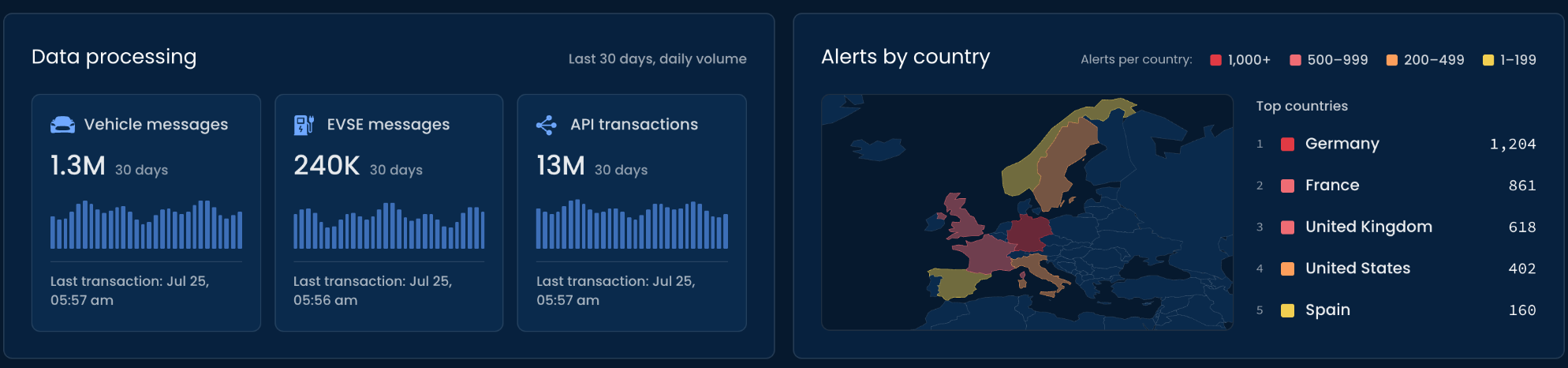
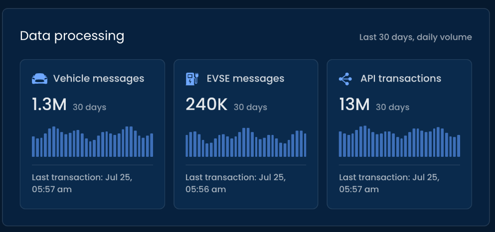
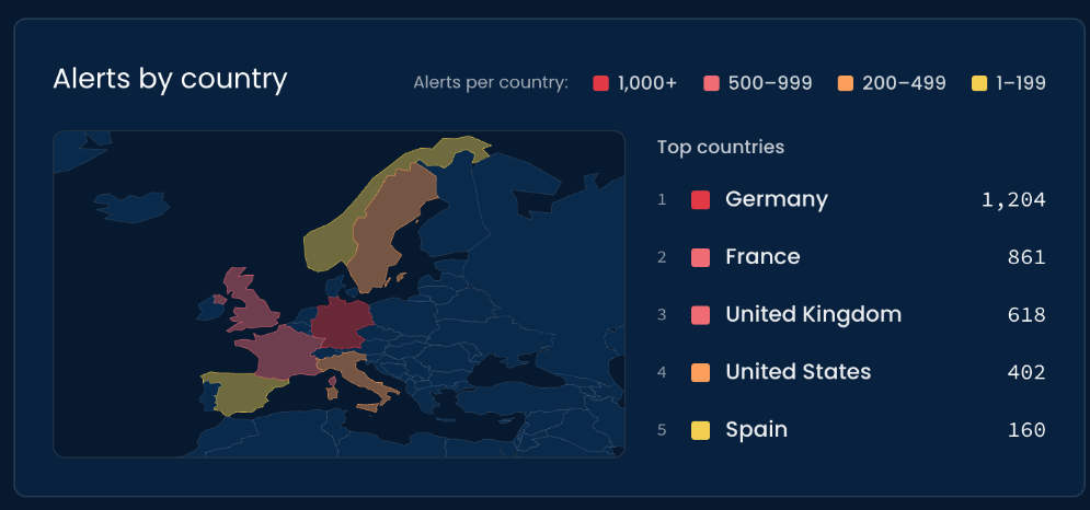
Data processing over the last 30 days: 1.3M vehicle messages, 240K EVSE messages and 13M API transactions, each with a daily volume chart and last transaction time; beside Alerts by country: a map of Europe shaded by alert volume and the top countries, Germany 1,204, France 861, United Kingdom 618, United States 402 and Spain 160
Data processing over the last 30 days: 1.3M vehicle messages, 240K EVSE messages and 13M API transactions, each with a daily volume chart and last transaction time Alerts by country: a map of Europe shaded by alert volume and the top countries, Germany 1,204, France 861, United Kingdom 618, United States 402 and Spain 160

05

THE EXPERIENCE

One dashboard, three levels of understanding.

  1. 01Scan
  2. 02Prioritize
  3. 03Contextualize

01SCAN

Understand the current state.

The analyst begins with Pending alerts and Monitored ecosystem.

Together they answer two immediate questions:

How much security work requires attention?

and

Is the monitored environment operating normally?

02PRIORITIZE

Understand what is driving the activity.

The Daily alert volume trend reveals how activity is changing over time.

Ranked threats and API vulnerabilities identify the issues contributing most strongly to the current security picture.

This creates a natural progression from overall volume to specific areas that may require investigation.

03CONTEXTUALIZE

Understand the environment behind the signals.

Data processing shows the volume and recency of incoming telemetry across the ecosystem.

Alerts by country adds geographic context and helps expose where alert activity is concentrated.

These signals support situational awareness without competing with the more urgent information above them.

From dashboard metrics to operational hierarchy.

The XDR Dashboard organizes a broad set of security and ecosystem signals according to how analysts need to consume them.

It begins with immediate workload, moves into the threats and vulnerabilities driving that workload, and then provides the operational context needed to understand the broader environment.

See what needs attention.

Understand what is driving it.

Keep the wider system in view.